What Your Product Is Saying Before You Even Open the Box
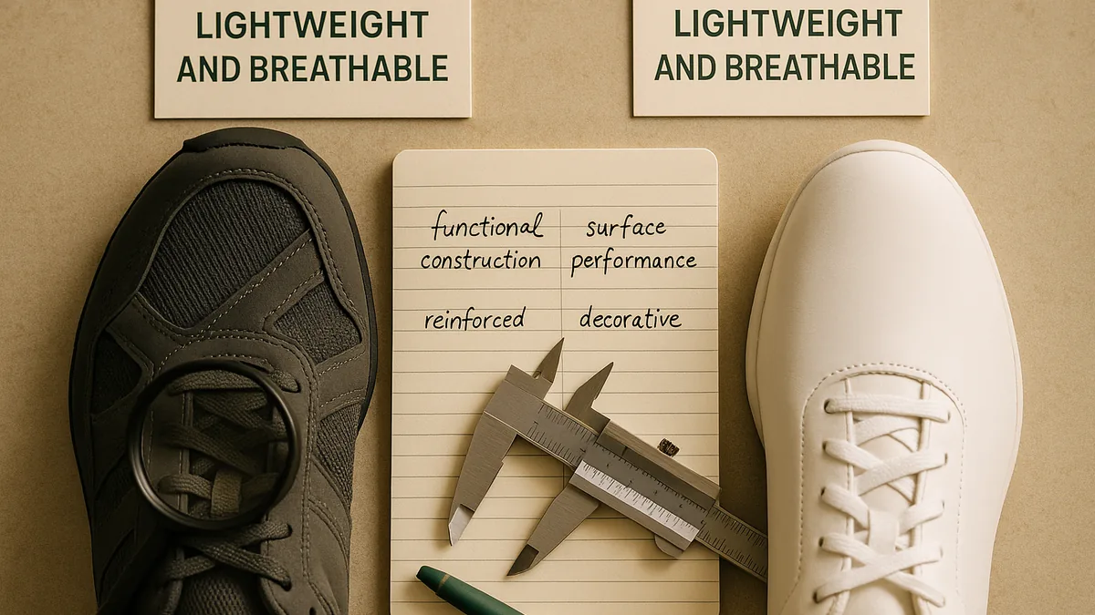
If you have ever bought something that looked brilliant on the website and felt cheap the moment you held it, you already understand the central argument here. Product design tells its own story — one that is often more honest than anything a brand publishes in a campaign. This post breaks down exactly how that works, and why paying attention to design details makes you a sharper buyer.
The Message Starts Before You Make a Purchase
Long before a product reaches your hands, its design is already communicating. The weight of the packaging, the colour choices, the feel of the fabric through a shop window — these impressions register faster than conscious thought. Researchers studying consumer behaviour have found that tactile and visual cues at first contact shape perceived quality in ways that take time to either confirm or correct.
Think of it as a silent contract. The design makes a promise at the point of contact, and then the product either keeps that promise every time it is used or quietly breaks it. Brands that understand this treat design as a communication tool, not just an aesthetic exercise.
Does the Design Match What the Product Actually Does?
This is the question worth asking with almost any purchase. There is a meaningful difference between a product designed to perform a function and one designed to look as though it performs that function.
A running shoe built for genuine training distances will show its intentions clearly: appropriate cushioning in the right places, reinforcement at stress points, ventilation where heat builds during extended effort. One designed primarily for shelf appeal tends to skip those details — and the omissions become obvious after a few sessions.
Mizuno is a useful example here. Its Wave plate technology is a structural feature that distributes impact forces across a specific geometry. It is not a logo or a decorative element — it is an engineering decision that only reveals its value during sustained use. That kind of design integrity cannot be communicated through advertising. It has to be experienced, which is precisely what makes it credible.
What Heritage Designs Actually Communicate
Brands with a long history face an interesting challenge. They have design archives that carry genuine cultural weight, but reissuing old silhouettes honestly is harder than it looks.
Fila's archive from the 1970s and 1980s — the colour-blocking, the BJ logo, the heavyweight cotton-polyester fabric — carries strong associations for people who lived through that era of European sportswear, as well as a distinct appeal for younger consumers discovering it fresh. When that heritage is reissued faithfully, the design credibility carries across both audiences. When it is approximated cheaply, the gap between the original and the imitation is immediately legible to anyone who knows what they are looking at.
Heritage-led design can communicate depth and authenticity, but only when the execution matches the reference. Otherwise it communicates something rather different: that the brand is trading on a reputation it is no longer working to earn.
When the Campaign and the Product Tell Different Stories
The most telling moments in any product assessment come when the marketing and the design are clearly pointing in opposite directions. This happens in two distinct ways.
The first is when a brand markets something as performance-grade but builds it to a specification that cannot support the claim. Materials chosen for cost rather than function, construction that only reveals its shortcuts after moderate use, finish that looks approximate rather than considered. This pattern is common in mid-market sportswear, and it erodes trust steadily as consumers gain experience.
The second pattern is the reverse: a product that is genuinely well-made but poorly communicated. Champion's Reverse Weave fleece is a good example. It uses a heavyweight loopback cotton construction with a horizontal weft specifically designed to resist shrinkage. The design logic is visible in the product and has remained consistent for decades. Yet Champion has historically underinvested in communicating that quality, which means many consumers overlook it in favour of louder, more heavily marketed alternatives.
The Details That Give the Game Away
Materials and construction details are where design communication becomes most legible — and most honest. Weight, the way a fabric recovers after being stretched, whether it pills after a few washes, how a zip pull behaves after repeated use: these characteristics are perceptible to anyone who pays attention, and they carry clear quality signals.
Flatlock seams versus standard overlock stitching, bar-tacking at predictable stress points, the placement of internal labels away from skin contact zones — individually these might seem minor. Cumulatively, they reveal whether a product was designed carefully or assembled to a price. Experienced buyers tend to develop an intuitive feel for this distinction, often without consciously cataloguing what they are noticing.
The Takeaway for Smarter Buying
Design is the most reliable signal available when assessing whether a brand's claims are genuine. Marketing campaigns can be polished and persuasive, but they have a limited lifespan — you encounter them once or twice before they fade. The product, by contrast, makes its argument every single time it is used.
Paying close attention to physical details — construction, material behaviour, functional logic — gives you a far more accurate picture of a brand's actual values than any campaign will. When those details hold up over time, trust follows naturally. When they do not, no amount of advertising closes the gap.
Key Points to Remember:
- Design begins communicating before a purchase is made, through packaging, weight and material cues.
- Functional honesty — whether a product is designed for what it claims to do — is one of the clearest design signals.
- Heritage designs carry layered meaning, but only when the execution matches the archive quality.
- A misalignment between marketing claims and product construction is often detectable through careful use.
- Construction details like seam type, material weight and stress-point reinforcement reveal design intentionality.
- The product is the most durable form of brand communication available — and the most honest.
If this gave you a new way of looking at the products you buy, the full editorial analysis on Review-It goes deeper into how design functions as brand communication across specific product categories.
Labels: product review, product design, marketing, consumer advice, brand analysis, buying guide
Read More
Read the original article and more from Review-It:
- Read the full article on Review-It
- 10 Sportswear Brands Bringing Innovation to Martial Arts
- Review-It — Independent, Evidence-Based Reviews
- Our Review Methodology
- Review-It on Facebook
- Review-It on Threads
- X (Twitter)
- Threads
- Bluesky
- YouTube Community
About Review-It
This article was produced by Review-It, an independent UK review site. Our verdicts follow a documented methodology, we accept no payment for coverage, and every correction is recorded publicly.


Comments
Post a Comment